
To create tour posters that sell out, focus on strong visual hierarchy by emphasizing the headlining artist with bold sizes and contrast. Use vibrant colors to evoke energy and excitement, but keep the design clear with high contrast for readability. Incorporate compelling imagery and minimal text to guide viewers’ eyes naturally from key details to supporting info. If you keep these principles in mind, you’ll discover how strategic design elements can boost attendance and engagement.
Key Takeaways
- Use prominent visual hierarchy to highlight key information like artist names and dates for quick recognition.
- Employ bold, energetic color schemes that evoke excitement and align with the event’s mood.
- Ensure high contrast between background and text to maximize readability and immediate impact.
- Incorporate eye-catching design elements that guide viewers’ attention toward essential details.
- Combine strategic layout and vibrant visuals to create memorable posters that drive ticket sales and sell-out events.
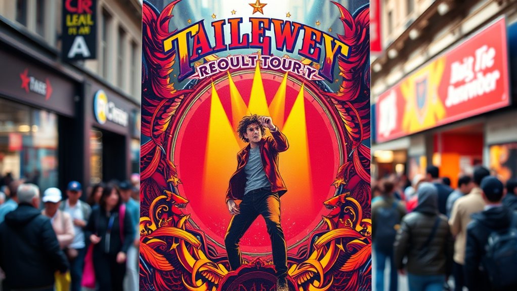
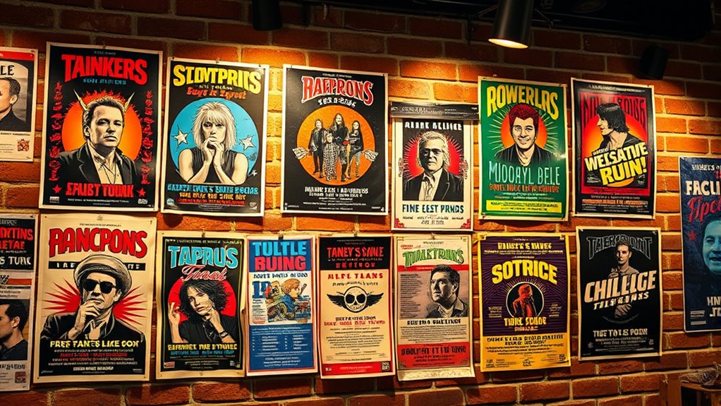
Have you ever noticed how tour posters instantly capture your attention and spark excitement for an upcoming event? It’s no accident. The best posters are carefully designed to draw your eye and communicate essential details quickly. Central to this effectiveness is understanding visual hierarchy—the way elements are arranged to guide your focus. When you look at a well-crafted tour poster, your gaze naturally moves from the most important information, like the artist or band name, to supporting details such as date, venue, and ticket info. Designers achieve this by playing with size, contrast, and placement, making sure that the key message is unmistakable. You won’t get lost sifting through clutter; instead, your eye is led effortlessly to what matters most.
Color schemes are equally significant in creating an impactful poster. Bright, bold colors can evoke energy and excitement, instantly grabbing your attention from a distance. Conversely, a carefully chosen monochromatic or limited palette can lend a sleek, sophisticated vibe, appealing to a different audience. When you see posters that pop, it’s often because the colors complement each other and support the overall mood of the event. For example, vibrant reds and yellows might suggest a lively, energetic concert, while cool blues and blacks could hint at a more intimate or alternative show. The contrast between background and text is also essential—it ensures readability and makes the important details stand out. If the colors clash or the contrast isn’t strong enough, the message gets lost, and the poster fails to excite or inform effectively.
Additionally, understanding visual hierarchy helps designers prioritize key information, making the poster more effective at attracting attention and conveying the intended message. You might not always realize it, but these design principles work behind the scenes to influence your perception. When a poster uses visual hierarchy effectively, it feels intuitive and compelling. Your eye is naturally drawn to the headline or main act first, then your attention moves to supporting information, all without confusion. The right color scheme amplifies this effect, reinforcing the mood and making the poster memorable. Whether you’re a designer aiming to craft a sell-out tour poster or just an attendee eager to buy tickets, appreciating these elements helps you understand what makes a poster stand out. It’s a blend of science and creativity—each element working in harmony to generate excitement, drive ticket sales, and ultimately, fill the venue.
Frequently Asked Questions
How Do Color Choices Influence Poster Sales?
Color choices heavily influence poster sales by leveraging color psychology to evoke emotions and attract attention. Bright, bold colors create visual hierarchy, guiding viewers’ eyes to key information like dates and headliners. You should choose colors that resonate with your target audience and reflect the event’s mood, making the poster stand out. Effective use of contrasting colors enhances readability and impact, increasing the chances of your poster selling out.
What Role Does Social Media Play in Promotion?
Social media plays a vital role in promotion by boosting digital engagement and expanding your reach. You can leverage influencer collaborations to create buzz and attract more fans to your tour. By sharing eye-catching content and engaging your audience actively, you increase visibility and excitement around your posters. This dynamic online presence helps sell out shows faster, as fans are more likely to share and promote your event within their networks.
How Early Should Posters Be Distributed for Maximum Impact?
You should distribute your posters at least 4 to 6 weeks before the event to maximize impact. This timing strategy guarantees your target audience notices early and has enough time to share through your chosen distribution channels, like local businesses, community centers, and social media. Planning ahead allows your posters to generate buzz, increase visibility, and build anticipation, giving your tour the best chance to sell out quickly.
What Are Common Mistakes in Designing Tour Posters?
Avoid common pitfalls like cluttered poster layout and poor typography choices, which can drown your message like a ship lost at sea. You might be tempted to cram too much info or use inconsistent fonts, but simplicity is key. Make certain your design guides the viewer’s eye smoothly and that text is legible from a distance. Steer clear of overcrowding and sticking to a cohesive style to make your poster truly stand out.
How Can Limited Edition Posters Boost Sales?
Limited edition posters boost sales by creating exclusivity and urgency. You should choose high-quality poster paper to make them feel special and durable. Select bold fonts that catch the eye and convey the theme effectively. Promote these posters as collectible items, encouraging fans to buy quickly before they sell out. Limited editions generate buzz, increase perceived value, and turn casual fans into dedicated collectors.
Conclusion
If you master the art of eye-catching design and clever promotion, your tour posters won’t just sell out—they’ll disappear overnight! Imagine creating posters so irresistible that fans scramble to get their hands on them, turning your tour into an unstoppable frenzy. With the right strategy, you’ll dominate the scene, making your posters legendary and your shows the hottest tickets in town. Get ready to make history—because when your posters sell out, nothing else compares!